About
I'm a front-end developer & designer that specializes in CSS - it is my passion and what I strive to learn more about. Whether it is experimental technologies or figuring out how to make something work in an older browser, each piece of knowledge I consider important and another tool in my skill set. I also have experience wireframing and desinging layouts, taking them from research to high-fidelity mockups. This also included building out prototypes in HTML/CSS when needed. I strive to make the front-end clean, easy to use and the best experience all around.
Resume
Skills
- HTML5
- CSS/SCSS/LESS
- UI/UX Web App Design
- JavaScript/jQuery
- Responsive Web Design
- Wireframing/Prototyping
- Adobe Creative Suite (with focus on Photoshop, Illustrator and XD)
Education
Texas State University, San Marcos
B.S. Computer Science | August 2014
Employment
Malauzai Software
UX Developer | November 2016 - February 2018
Lead efforts to provide guidance in CSS for front-end teams, while providing additional support for UX-related issues. Wrote new standards for CSS usage. Also assisted in efforts to refactor SCSS, which cut its total code size by 60%. Researched, wireframed and designed high-fidelity mockups for web app UIs while providing documentation. Assisted in internal usability studies.
Tech Stack: CSS/SCSS/LESS, HAML, React, webpack
TG/Trellis
Front End Developer (Contract) | June 2016 - July 2016
Worked with a team to develop a Wordpress-backed intranet. Handled site content editing and adjusting, researched and recommended solutions to stakeholders, consulted with team members for design feedback and decisions. Created and managed custom CSS for the site.
Tech Stack: CSS, Wordpress
adWhite
Web Developer | September 2015 - January 2016
Developed Wordpress-backed websites from PSD mockups using HTML/CSS/SASS/JS. Refactored and converted older websites to modern, responsive standards. Handled asset management using Grunt and Gulp.
Tech Stack: CSS, JavaScript, Wordpress
Neubus
Jr. Web Applications Developer | May 2013 - May 2014
Implemented client-facing features in a legacy PHP web app. Developed responsive websites using Bootstrap, while also designing UI layouts for mobile apps. Handled minor backend changes in a Rails environment when necessary.
Tech Stack: CSS, JavaScript, jQuery, Bootstrap
Projects

Twitch Stream Overlay
Produced for: Self
Stack used: Node | Express | HTML | CSS | JS | AJAX
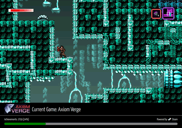
This was developed to serve a dual purpose - to teach myself more about APIs, and give me a slicker, more dynamic layout to use while streaming. What this does is ping the Steam API to check what I'm playing, then uses that information to get the game's name, Steam badge and any achievement information. If Valve makes their API more robust, I'll be able to add more features to it in the future.

Dr. Peter Bigler Responsive Renovation
Produced for: adWhite
Stack used: HTML | CSS3 | JS
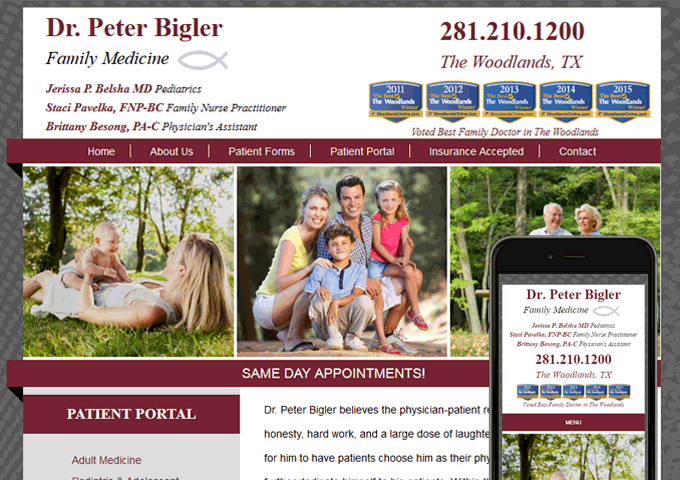
For this, I had to modernize the codebase, as the original version was written using almost exclusively tables. However, the main challenge lied in recreating the website perfectly, accoutrements and all, as a lot of elements had used images originally. The secondary challenge was to create a usable layout on mobile, with trying to translate the desktop design to something that stays faithful to it on mobile.

Texas Home Medical
Produced for: adWhite
Stack used: HTML5 | CSS3 | PHP | Wordpress | JS
This was the first site I built using Wordpress, which took some getting used to, with all of its built-in functions to handle pretty much everything. The biggest hurdle here was figuring out how all the pieces fit together, as Wordpress is very friendly externally, but internally it can be rather intimidating. Other than that, it was a pure translation from PSD mockup to full-fledged site using HTML/CSS/JS.

Tristar Shredding
Produced for: adWhite
Stack used: HTML5 | CSS3 | PHP | Wordpress | JS
This was the second site I built with Wordpress, and as such, was a much easier thing to put together. The challenge this time was something minor, but important: how to deal with a sidebar in a responsive layout. We couldn't simply not show it, as it had important information pertinent to the client. After discussing it with the project lead, we decided on a compact version being displayed below the main content was the best choice, as it remained, but did not get in the way of any of the page's content.

Sleep Health Clinic Responsive Renovation
Produced for: adWhite
Stack used: HTML | CSS3 | JS
This was the third site I renovated for adWhite, and this one provided the biggest challenge yet, as the majority of the original layout was built using images, whereas the other two were mainly built with table elements providing the layout. For this, I pulled out the images, examined each of them to figure out their specific purpose (some were to provide structure, some for drop shadows, some for other purposes) and from there, recreate them using HTML/CSS.

Anesthesia Alternatives Responsive Renovation
Produced for: adWhite
Stack used: HTML | CSS3 | JS
This was the first site I renovated for adWhite - and as such, the majority of the time spent on this was deconstructing how the site originally worked. From there, I sat down and took notes on everything I needed to change while double-checking the CSS where appropriate to test out those changes using developer tools on Firefox & Chrome. Doing this has helped on other projects where the internal structure is very similar.